
Yesterday was the birthday of a friend of mine. I realised that there was nothing to give her as a birthday gift, which matches my choice. A card is always great , especially if it is fully personalized and customized. So I launched GIMP, and started to think and experiment. I am trying to describe how I made the card/wallpaper with GIMP . I have tried to make it very simple. Yet again I have used the flame effect. I think it is getting monotonic, as a friend pointed out, and I should try something new and different. Please let me know your comments :) .
Process
-
Take a new image of your screen resolution (i took 2560 x 1536 for this picture). Make a background with colour #1d1d1d. Name this layer “background” . Apply the below steps to this layer:
Filters -> Noise -> RGB :
{
  Correlated Noise: Checked;
  Independent RGB: Checked;
  Red: 0.05;
  Green: 0.08;
  Blue: 0.8;
  Alpha: 0.0
}
And then
Filters -> Gaussian blur :
{
  Horizontal Blur: 25;
  Vertical blur: 0;
}
This will make the background a bit brushy. Making the Blue channel higher will make a blue brush effect, also try doing the Red and Green channel high.

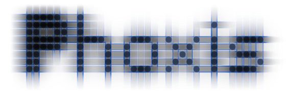
Brushed black background - Download the Select Bazaronite font, from the attached files section, and install the font. Type in your name or a text with a favourite colour, and a normal text size which is not too big, with this font. Name this layer “text” .
-
Create a new black filled layer, make a copy of the “text” layer and merge the copied text layer on new the black layer, and apply the below to this layer.
Filters -> Softglow :
{
  Glow Radius: 50;
  Brightness: 0.7;
  Sharpness: 1.0;
}
And then
Filter -> Gaussian Blur :
{
  Horizontal Blur: 25 or 35;
  Vertical Blur: 0
}
After these
Color -> Colorify to Alpha :
{
  Select #000000 to be converted to alpha
}
And click ok. This will convert the softglow applied and blurred text to appear with transparent background. Name this layer “text_shadow” and move this layer just below the original “text” layer. Now we have a soft glowing and stretchy text effect.
Test the blur effects with different amount of horizontal and vertical blur to get different effects. -
Create new transparent layer. Name this layer “pathstroke” .
Select Paint Brush tool, and select the Sparks brush.
Draw a path, along the top right corner of the screen bounding the text on the top right.
Click stroke path in the main toolbar select the option stroke with a paint tool, select Paintbrush, and stroke.
Change the brush dynamics from the paintbrush and or select other tools and try and test to get better effects.
Making the path and stroking -
Create a new transparent layer, and render a flame on bottom left Name this layer “flame” . Apply flame as below :
Filters -> Render -> Flame :
{
  Open , and select extracted the file after download
         else, add your own effect.
}
To use the flame pattern i have formed after a lot of trial and error, download the flame file from the attachments section.

The Flame effect -
Create new Transparency layer, name it “gradient” and position it below the “text_shadow”. Select paint brush, and select some soft color. I have selected #ffe69b . Check the Fadeout box, select the fadeout length to 1000px. This will depend on how far the text is away from the corner if the screen, and also the size of the image. Then draw two parallel lines and bound the text from top and bottom. Make a point first then press Ctrl to draw straight lines.
Now select the Rectangle select tool, and select a rectangle around the text, on the “gradient” layer, and feather it to 200px. Note if you have smaller dimension image, then you need to feather less. Select the Blend toolBlend Tool : { Gradient: Flare radial 101; Mode: Normal; Opacity: 100; Offset: 0; Shape: linear; Repeat: None; Dithering: Checked; Adaptive Supersampling: Unchecked; }And now apply the gradient on the selection dragging from right end to left end of the selection.

Gradient -
The final layer positions are shown below.

Final Layer Positions


Attachments
Bazaronite Font : Download Bazaronite font here
GIMP Flame File : Download the GIMP flame file used in this tutorial here
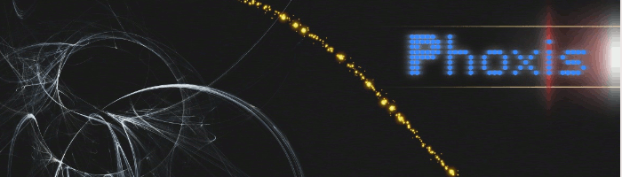
Final Product
At last this is the final product of my version.


Hi Arjun, another great tutorial! I bet the card was also. I haven’t tried these techniques you mentioned, thanks for posting how to do them =)
Thank you very much. It is very good to know you liked it.
nice nice nice